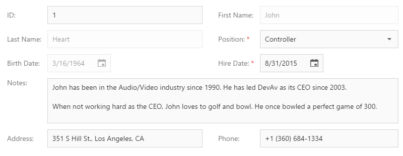
New major version will ship with a great new addition to our HTML5 / JavaScript widget collection - dxForm. As I'll explain in a moment, this client-side widget was designed to simplify how you create and layout forms. You may be asking how easy is it to use...The answer is extremely easy. The following screenshot represents a simple form - with a single column layout. To generate this layout, you simply create a form instance and pass a data object to it. When the dxForm widget generates a form item for a data field, it selects the appropriate data editor (based on data type) and transforms the data field name to a label with appropriate text. For instance, if a data field name is “firstName”, “First Name” will be used for the label. If the auto-generated label does not meet with your satisfaction, you can implement a custom algorithm for label text generation. dxForm allows you to specify validation rules for individual items. If rules are defined for an item, it is marked as a required. Each editor is validated separately when it loses focus. You can, however, validate all editors simultaneously by calling the validate method (when validating all editors, a validation summary will be displayed at the bottom of the form). orm item values are automatically updated when you assign a new data object to the formData option. Alternatively, you can update the required data field using the updateData method. In this instance, the widget is not re-rendered...It only updates the required item values. Two-way binding for AngularJS and Knockout is also supported.